The Elements of a Landing Page That Converts
9 Elements of a Landing Page
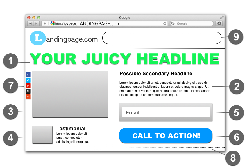
The number one goal of a landing page is to convert web traffic into leads. In order for that to happen, your landing page must meet certain criteria. Let's take a closer look at that criteria and breakdown the anatomy of a landing page that converts.

1. Page Headlines
A great headline should not only grab the reader's attention, but it should also be specific, create a sense of urgency, and present some sort of value to the reader. Remember, the headline is the first thing people look at before they continue to read the rest of the page. A compelling headline has the ability to draw your audience in and increase engagement. That's why it's important to spend a little extra time crafting the right headline for your copy.
2. Ad Copy
Once the headline has drawn the reader in, it's the job of the copy to keep them there. However, ad copy shouldn't be treated like regular content. Whenever you're writing copy you should clearly speak to the target audience, yet lead them to take action. That's why it's extremely important to know your target audience's “persona” before you even begin to write. If you know what triggers your audience, then your copy can focus on those triggers and ultimately lead them to take action.
3. Video or Image of the Offer
Having a video or image of your offer will almost always increase your conversion rate. Whenever someone lands on a landing page and there's some sort of media explaining or showing the offer, this instantly creates a level of trust. Plus, a good image or video can present a much better perspective of the offer than if you were to just write about it. When people can literally see what you're offering, they'll be much more inclined to follow through and take action.
4. Testimonials
Another great way to build trust is to have testimonials of satisfied individuals on the landing page. This gives social proof that the offer presents some sort of value to others, and it lowers a visitor's apprehension to opt-in. Keep the testimonials short, use smiling pictures of the individuals, and be sure to embed them above the fold (see number 8). It's also a good idea to always ask permission before you post someone's testimonial on your landing page.
5. Opt-in Form
A landing page isn't a landing page without an opt-in form. Simply put, an opt-in form gives visitors a way to submit their information. This typically includes an email address and first name. However, there are various styles and different types of opt-in forms available. Bottom line though, an effective form will convert web traffic into qualified leads. As long as you have an opt-in form on your landing page, you are increasing the probability of a higher conversion rate.
6. Call-to-Action
Getting visitors to your landing page is the easy part. Getting them to take action, not so much. That's why a good call-to-action, commonly referred to as a CTA, can effectively compel traffic to click their mouse and take action. A CTA could be a button, image, link, or a line of text asking visitors to follow through and take action. However, the main purpose of a call-to-action is to guide traffic to a specific conversion point.
7. Social Sharing Links
Sharing is caring, so they say, and giving your audience an avenue to share your landing page is key to any growth strategy. Additionally, by having social sharing links, you're increasing your chances of reaching new audiences and leads across multiple social media networks. There are various types of social sharing plugins available for WordPress users, but I use and recommend Monarch Social Sharing.
8. Above the Fold
Whenever someone visits a website, everything that initially appears on the screen is considered “above the fold”. The fold being an imaginary line that divides what can and can't be seen on the computer screen when it loads. Above the fold is where the most important information and CTA's live. If someone visits your landing page and they have to scroll to the bottom of the screen to either take action or opt-in, chances are they'll probably bounce. Rule of thumb, try to keep all of these elements above the fold.
9. No Navigation Bar or Links
The primary goal of your landing page should be to convert traffic into leads. So, this means that you don't want any distractions. By removing the navigation bar and various links, you're taking away those distractions and allowing your visitors to concentrate on the landing page. This also helps your visitors to focus on what's important and ultimately decreases your bounce rate.
Conclusion
So there you have it; the elements of a landing page that converts. When used correctly, these components can produce some great results. If you're new to landing pages, then I highly recommend that you check out Divi and the Divi theme builder. I use Divi to design all of my landing pages and I've been extremely impressed with the conversion rates. Give them a shot when you're crafting your next landing page.

Written by Ben Cummings
Founder of blogwithben.com
Ben is a Digital Marketing and CMS Specialist for Bridgepoint Education who holds an MBA with a specialization in Entrepreneurship. He enjoys teaching, blogging, startups, a hoppy IPA, and college basketball. Whenever he's not blogging, you can find him cruising around sunny San Diego with his amazing family.

